


RED BULL
HOME GROUND
___________________________________________________
"Home Ground by Red Bull is a new pro VALORANT competition which will showcase the best teams in Europe as they battle in a unique format for supremacy and a £24,000 prize pool..."
TOURNAMENT GRAPHICS
________________________________________________________________________________________________________________________________________________________________________
INITIAL CONCEPTS
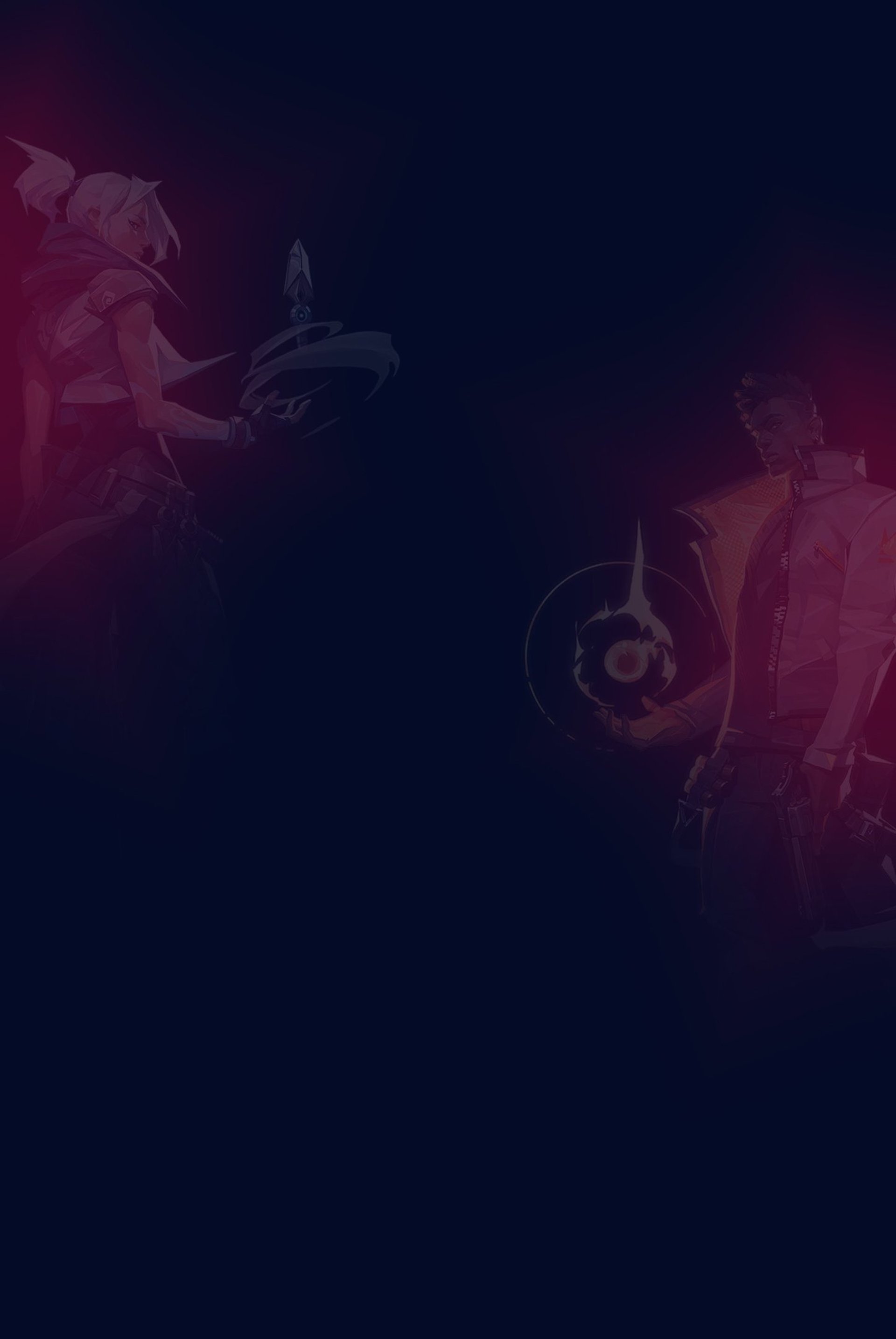
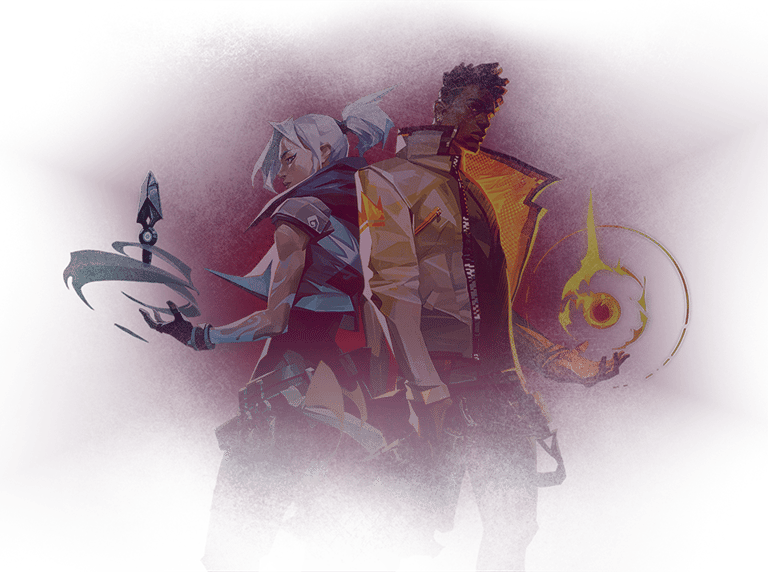
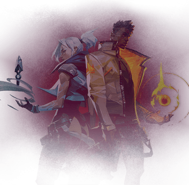
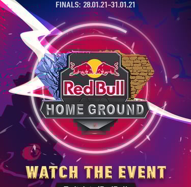
As this is a Valorant competition and the Home Ground logo had been designed to resemble the spike, I wanted to build on this concept and design some visuals that are equally charged with explosive energy.
I produced two initial designs based on this concept with some variation in style, in order to offer the client a choice in direction.
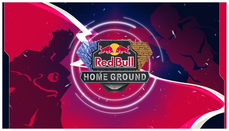
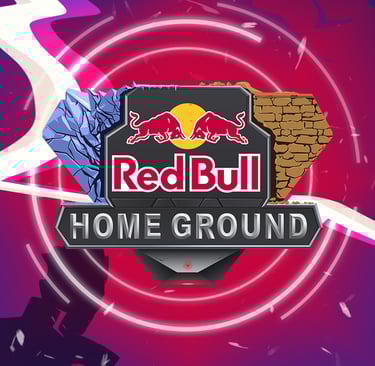
Concept ONE focusses exclusively on the spike and has a greater sense of realism about it in comparison to concept TWO, which features a more complex design with vector graphics. While concept ONE offered an ideal amount of clear space to incorporate text, concept TWO expressed the nature of the tournament more clearly and simply had a greater impact. Thus, it would ultimately become the chosen design to represent the tournament.
Concept ONE
Concept TWO
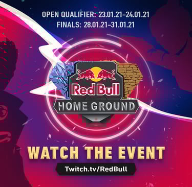
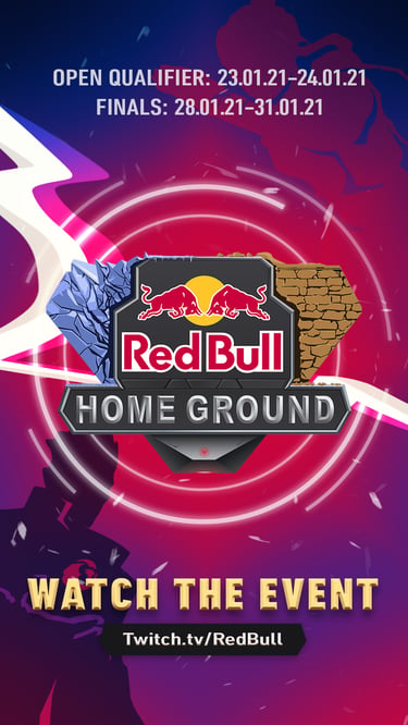
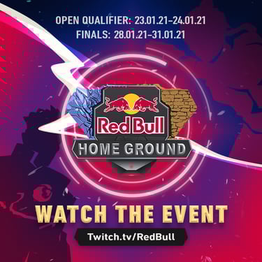
To reinforce Red Bull’s brand, I used their iconic blue and red to represent the agents Jett and Phoenix, each facing off from their corner of the design.
The activated spike – represented by the logo – takes its primary position in the middle of the composition, while big electric bolts separate the rivals' bases and finish the design with a visual energy surge.
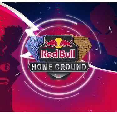
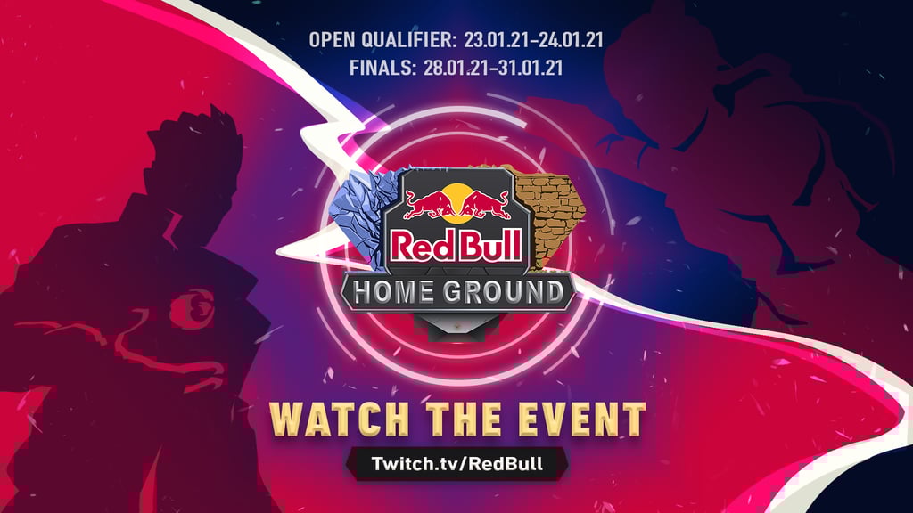
WEB BANNERS
________________________________________________________________________________________________________________________________________________________________________


_____________________________________________________________________________________________________________________________________________
DESIGNER: Inny Goossens
CLIENT: RED BULL
AGENCY: DLC Studios
SOFTWARE & TOOLS:
CREATIVE DIRECTOR: Sammy Lam, Kalvin Chung
LOGO DESIGNER: Qiushi Tian (Chase)
Copyright 2026. All Rights Reserved
_____________________________________________________________________________________________________________________________________________